
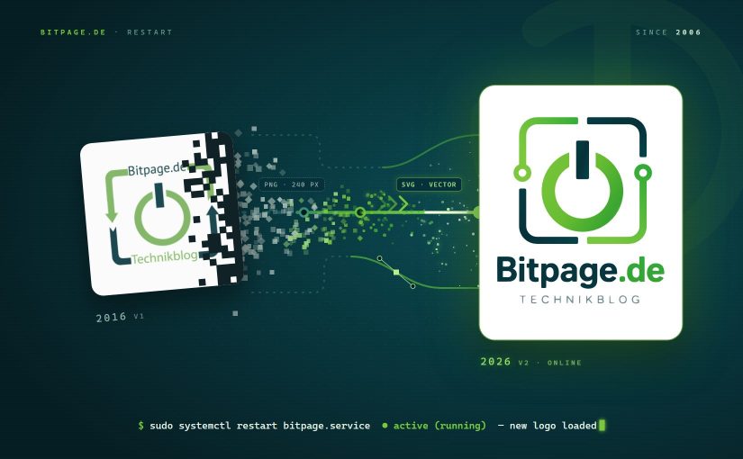
After almost ten years, it was high time for a new logo. Or at least a “modernized” one. The power button made of 0 and 1 stays, and so do the light and dark petrol colors. This time, though, it comes as a scalable vector graphic. In my view, that’s a must these days if a logo is supposed to look good across the whole range of different displays.
Continue reading Time for a New Logo