
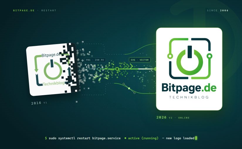
After almost ten years, it was high time for a new logo. Or at least a “modernized” one. The power button made of 0 and 1 stays, and so do the light and dark petrol colors. This time, though, it comes as a scalable vector graphic. In my view, that’s a must these days if a logo is supposed to look good across the whole range of different displays.
Continue reading Time for a New LogoCategory: On one's own account
News about Bitpage itself: changes, the new logo, reviews and plans.

URLs like/2017/general/blogtitel aren’t up to date anymore
In the past I was a fan of this URL-structure, which is often called permalink. This kind of structure gives the searchengine user the direct view of the date. This helps saving valuable “Click and View”-Time if you only look for newest websites. But Google has improved his Result Pages and shows the publish dates of the websites directly in the SERPS directly under the title with the help of structured data. Therefore this main bullet point became six feet under for me.
Continue reading URLs like/2017/general/blogtitel aren’t up to date anymore
